I have always been a little suspicious of the official unemployment rate, just from observing the ways people can be in or out of work, and the many ways it can be measured. Disability and workers compensation claims seem to rise when jobs are scarce. People may decide to go to law school, stay home with the kids, take temporary jobs, or start drawing a pension rather than continue a fruitless search. None of these substitutes show up in the unemployment figures.
I find the labor force participation rate a lot more straightforward. It includes anyone over the age of 16 who has a job, whether permanent or temporary. The rate of participation declines as a population ages, of course. You can drill into the Bureau of Labor Statistics database for more details, but the overall picture is pretty bad.
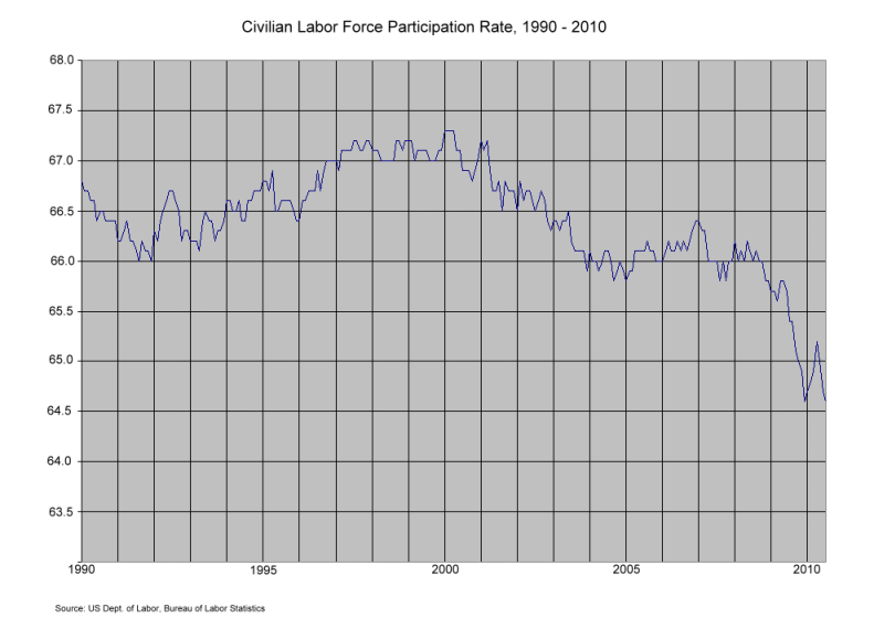
At the end of 2008, it all went south in a hurry:
The National Bureau of Economic Research nearly called the end of the recession as July 2009 at their April 2010 meeting, based on positive GDP reports, yet job losses are accelerating (unexpectedly). There is very little point in trying to stimulate the economy while making it less attractive to hire American workers. How long before someone in the Obama administration figures that out?
Just a couple more observations, based on this chart and some of the other things I found rummaging around in the data:
- The jobs lost in the 2000-2001 recession don’t seem to have ever come back. The percentage of people in the workforce stabilized, but never recovered. This time, it looks like the re-employment picture will be even worse.
- The biggest change in the rate since WW II was caused by the massive entry of women into the workforce (not shown in this chart). In the past few years, the rate of workforce participation for women has actually decreased slightly. Men’s employment picture is far more dire, but the change in women’s employment rate, while much smaller, is unprecedented.
- The Boomers are not retiring. Their workforce participation rate is well above forecast. Have you looked at your 401(k)?
Mitch, that is an ugly chart.
We need to get the damn anvil off our foot.
Uncle Sam is in the way.
The stimulus was peed down the drain.
The uncertainty blocks new hires.
The USA is increasingly not a good place to do business.
We need a stiff broom.
I worry that the GOP won’t do what it takes.
Part of this is probably brought about by the obsessive focus on educational credential, removing a significant number of those under 30 from the workforce. That’s clearly not the main factor over the last couple of years, though.
Maybe I should have waited a day: the rate was essentially flat for August at 64.7%. The new normal?
>>I worry that the GOP won’t do what it takes.
Lex,
This isn’t about the GOP.
It is about the American public replacing the current Leftist elites.
I worry that the GOP won’t do what it takes.
__
I agree on that point. I am pulling for the GOP but fear the return of the Hastert/Lott/Stevens/LaHood pork types whom we all know are lurking around the GOP cloakroom. At this point a lot of us are like Fox Mulder–we want to believe. Let’s hope they get it together.
The dropping trend also coincides with the post tech boom-let of the 90’s. As an ‘IT’ guy at a F 500 company, I can clearly point to an increase in the deployment of productivity enhancing measures all throughout this last decade, with each successive iteration getting better at delivering useful tools and improving our understanding of what our end users need. It’s the productivity boom promised for the 90’s but showing up in the 00’s instead.
Re: Wlpeak’s comment.
Actually, I think it goes back to the 80s when I first heard the term, paperless office. I agree that the promised productivity trends are finally appearing, for better or worse. It’s just that I’m old enough to remember the first promises — in the 80s. But what’s 30 years among friends.
Wasn’t there a mini babyboom after the 2001 terrorist attacks? I think I remember people also saying Bush’s taxcuts allowed their wives to stay home with the kids. Bad times aren’t the *ONLY* times women opt out of the labor market.
That said…
As a small business person, right now really bites. We have no idea how much our health care costs are going to increase or how much our accounting costs will increase (hello new 1099 rules for vendors!), not to mention how other tax changes will affect us. Can’t seem to get a straight answer anywhere.
My husband and I do see business on the uptick, but we’re afraid to hire or even engage new contractors.
And the climate of the public…they seem to blame businesses for being afraid to hire! Or they accuse of us lying about the need to hire! “If there was work for them you’d hire them”.
Idiots. No. In uncertain times the owners of small businesses will work until 2 a.m. and pull 80 hour work weeks and stash the cash. We have that option, it’s our *business*.
It’s easy to read too much into this statistic. Look at the data from 1950 to 2010. There was a decrease from 1950 to 55, a jump in 56, then a steady decrease from 1956 to 1964. Then it shows a steady increase from about 1964 to about 1990. The steepest increase seems to be from about 1976 to 1980 (the Carter years). So I wonder if the data have any real meaning. Did the rate decline during the 50s because women decided to stay home when one paycheck could earn enough to support an entire family? Did it increase during the Carter years because the economy was so bad that both adults needed to work? Did it increase during the Reagan years because the tax changes improved the risk-reward ration and so more people decided to start businesses? I don’t see how we can read anything useful from the 2000-2010 chart.
The fact that we never recovered properly from the 2000-2001 recession never gets enough acknowledgement. The dot-com bubble bursting had a lot to do with that, but it has to go way beyond that. Jobs in my industry, in my hometown, were much easier to find before 2000 and basically impossible afterward. A lot of that has to do with my dysfunctional city and state, whose idiot politicians have made chasing businesses away a personal crusade, but I think at the national level the crisis was never taken seriously enough. Personally I’m optimistic enough to think the jobs we’ve lost more recently can come back, and so can the ones we lost ten years ago, but it will take some radically obvious changes to economic policy that the clueless disciples of Keynes would never try. (How much prosperity has that bozo’s legacy cost the world, I wonder?) We need a President and a cabinet who understand real-world economics, who can push Congress into getting the right changes made. What scares me is neither major party has offered up anyone with those qualifications.
You might also want to take a look at the *employed-to-population* figures available at the BLS.
*Both* the numerator and denominator in that particular statistic are much less amenable to politically-convenient manipulation and creative re-definition than are such things as the “unemployment rate” and the “labor force”.
By and large the “E-2-P” numbers mirror those of the labor force chart above (perhaps they are even a little *worse*).
I believe that the BLS breaks out the “E2P” by age cohort as well – which helps slay those who argue that E2P is “of course declining because of an aging workforce”.
Please take advantage of your Instapundit viewer surge and post some E2P charts by age…
My stats professor always told us not to over-analyze patterns in charts like this, but I can’t help it:
If you look at around the 2005 to 2006 range, it looks like the data are getting ready to bounce off the bottom, much like the sinusoid-ish pattern back in the early ’90s. Then something happened in 2006 going into 2007 to push the chart off its historic pattern.
Now, let’s see… what event could’ve happened at the end of 2006 to cause this. Hmmmm….
There are a couple of confounding social/political trends that imact this curve. First, how many illegal immigrants are counted in the base population but are working “under the table”? 12 million illegals are about 4% of the US population and we’re looking at a 2% delta in work force participation. Look at a contruction site today and try counting the American citizens amongst the workers.
Secondly, women in the workplace. The Carter years were the big spread of feminism coincident with the entry into the work force of the Baby Boomers. Today, I think I’m seeing women with a greater appreciation of motherhood and especially the advantages of being a stay-at-home mother. For many older women, high marginal tax rates and low pay from re-entry jobs make working again marginal economically.
Still, I agree that unemployment RATE is not telling us the whole story and has been manipulated for political purposes – see the business birth/death estimator for one.
RE: Employed-to-Population Percentages Over Time and By Age (You’ll be shocked by the divergent fates of the 25-54 and 55+ age cohorts)
from http://data.bls.gov:8080/PDQ/outside.jsp?survey=ln (can’t get a good URL for the query results – but this URL will get you to the query page itself)
Data extracted on: September 3, 2010 (4:21:41 PM)
Labor Force Statistics from the Current Population Survey
Series Id: LNU02300000Q
Not Seasonally Adjusted
Series title: (Unadj) Employment-Population Ratio
Labor force status: Employment-population ratio
Type of data: Percent or rate
Age: 16 years and over
Combined 25-54 and 55+ Cohorts
Year Qtr1 Qtr2 Qtr3 Qtr4
1990 62.5 63.1 63.3 62.5
1991 61.0 61.9 62.2 61.5
1992 60.5 61.6 62.1 61.5
1993 60.6 62.4 62.4 62.1
1994 61.4 62.5 63.1 63.1
1995 62.3 63.0 63.3 63.0
1996 62.1 63.2 63.8 63.6
1997 62.8 63.9 64.3 64.1
1998 63.4 64.2 64.4 64.3
1999 63.7 64.3 64.5 64.5
2000 64.0 64.6 64.5 64.4
2001 63.8 63.9 63.7 63.2
2002 62.3 62.9 63.1 62.7
2003 62.0 62.4 62.4 62.4
2004 61.8 62.4 62.7 62.6
2005 61.8 62.8 63.2 63.0
2006 62.4 63.1 63.4 63.5
2007 62.7 63.1 63.2 63.0
2008 62.2 62.6 62.4 61.5
2009 59.6 59.7 59.3 58.6
2010 57.9 58.8
For Prime Working Age Cohort (25 to 54):
Year Qtr1 Qtr2 Qtr3 Qtr4 Annual
1990 79.7 80.0 79.6 79.6
1991 78.2 78.9 78.6 78.8
1992 77.7 78.6 78.4 78.6
1993 77.7 78.6 78.6 79.3
1994 78.4 79.1 79.3 80.2
1995 79.4 79.7 79.7 80.2
1996 79.4 80.0 80.4 80.9
1997 80.1 80.8 81.1 81.4
1998 80.6 81.1 81.1 81.6
1999 81.2 81.4 81.1 81.9
2000 81.5 81.7 81.0 81.6
2001 81.0 80.8 80.2 80.1
2002 79.4 79.4 79.2 79.3
2003 78.6 79.0 78.6 79.0
2004 78.5 79.1 79.0 79.3
2005 78.8 79.4 79.5 79.7
2006 79.3 79.7 79.8 80.5
2007 79.8 80.0 79.8 80.1
2008 79.4 79.5 79.0 78.4
2009 76.2 76.1 75.5 75.4
2010 74.6 75.3
For AARP’ers (55+)
Year Qtr1 Qtr2 Qtr3 Qtr4 Annual
1990 29.1 29.2 29.1 29.1
1991 28.3 28.6 28.4 28.3
1992 28.2 28.5 28.1 28.2
1993 27.9 27.9 27.9 28.3
1994 28.6 28.9 28.6 29.3
1995 28.8 28.8 28.8 29.3
1996 28.9 29.1 29.2 29.7
1997 29.7 30.0 29.7 30.7
1998 30.2 30.4 30.2 31.0
1999 30.6 31.0 30.9 31.3
2000 31.5 31.5 31.4 31.7
2001 31.9 32.1 32.2 32.6
2002 32.6 33.1 33.4 33.8
2003 34.0 34.1 33.9 34.8
2004 34.8 34.6 34.8 35.4
2005 35.2 36.0 36.0 36.6
2006 36.4 36.8 36.8 37.5
2007 37.0 37.3 37.5 37.9
2008 37.8 37.9 37.8 38.2
2009 37.5 37.5 37.1 37.3
2010 37.2 37.6
If you want to really focus on the essentials, just track private sector employment and private sector hours worked, both regularly reported by the Bureau of Labor Statistics. Compare to working age population, say 19-to-64, estimated by the Census Bureau. This gets rid of all the extraneous stuff and boils it down to how well the economy is using available labor, and how much work is generating the economic value that we all, including the government, depend on. Doesn’t matter is a working age person is not working because they can’t find a job or they gave up, they’re not working and therefore not helping create value. Doesn’t count government employees, not because they don’t do worthwhile things, but because someone has to pay for them, and my way tracks our ability to do that.
All the other stuiff is interesting and important in some ways, but the three data I mentioned are the essence for non-specialists who want to know how we’re doing.
Which, by the way, is, “Not very well.”
I agree with Spec Bowers that you’re reading too much into it. The drop from 2001 to 2004-05 — the worst of the pre-financial crisis period — was less than 1.5 %, and recovered almost half that by 2007. Your chart shows that (although it may be cut-off on many screens/browsers). View the chart in a separate window or make your own chart here (check “Labor Force Participation Rate” on the “seasonally adjusted” column, then change the start date to 1990 and check the “include graphs” box). Starting at that same link, if you check “Unemployment Rate” (with the same parameters as above), the mid-2000s recovery is even more apparent.
Yes, the economy’s turned sour starting in 2007. And I don’t have a quick fix. But I’m not convinced it’s a long-term trend.
Marty,
Not working does NOT necessarily mean “not creating value” – note triple negative!
Stay-at-home motherhood is creating value (the adult you, for example). Economic performance is not the sole measure of a society.
Yet I will concede that working hours per head is a great measures of economic activity over time in a relative sense. Productivity modifies that measure to get real wealth generation.
I think the late 90s period was an anomaly due to the economic (dotcom, fiber-optic, etc.) bubble. During that time, I started playing a game with people asking them if they had run into anyone who had no business being in the workforce, but was. Everyone I asked had a good story. I started doing this after a harrowing airport rental-car-shuttle ride, where it was very clear the driver had no grasp of the basic concept of the job (like not starting to move again while people were still getting on and off the shuttle). He didn’t strike me as stoned or drunk, just incapable of understanding these very basic principles.
As much as it might seem nice to have a labor market where anyone who wants a job can instantly find one, I don’t think that can be the normal economic condition.
Context. Not saying that the analysis is wrong, but 63 seems to be an arbitrary baseline.
Whew, take a day off and what happens? My oldest child, Dr. Peter Townsend, was married today to Dr. Melissa Duarte, so I was necessarily away from my computer.
Spec Bowers and Roy:
There were 2 reasons for truncating the data at 1990:
1. If you go back far enough, like to the 1970’s and 1980’s, you start picking up changes in the composition of the labor force: more women, less manufacturing and extraction, less technology. My feeling is the data is less comparable. They also had a data collection or definition change somewhere in there, with a warning about comparing across periods.
2. As CAS127 found out, the tables of data are presented so that it is awkward to extract and chart them yourself. I did a lot of copy/paste-special/transpose in Excel to get to where I could chart it myself, and even then I had to use a graphics program to get the axes labeled so you could read them. By the time I got back to 1990, I considered the task essentially done. Call it laziness or call it efficiency, but the 80%/20% rule cut in about there.
No Oil for Pacifists:
You might as well quote Adam Smith: “Be assured, my young friend, that there is a great deal of ruin in a nation.” Let’s hope we don’t get the chance to make an accurate measurement. I agree that it is unreasonable right now to go around saying that the sky is falling, but I’m keeping an umbrella in my car.
If you like, I will ferret out more good stuff from the data. This one was actually a byproduct of something else I was looking for. Since gender/pay comparability seems to be back as an issue, I was going to look for gender/workplace injury data, but it looks to be difficult to get at directly. Gender/workplace deaths: something like 93% male. More to come.
I went to the linked website and looked at the numbers and the graph, I am not, inter alia, an economist, statistician, or demographer, but, the story I see in the graph is a lot more about demographic changes than economic cycles. I think you would have to do some pretty fancy foot work to separate the two.
I agree with the earlier commenter as someone who uses these data; look at employment/population since that’s the share of noninstitutionalized civilians 16 and over who say that they’re actually working. The wiggles in that series track the unemployment rate very well, while the trend tracks the participation rate very well. Participation does move a little bit in recessions but not by all that much. Participation basically reflects long-term trends like women entering the labor force, men slowly leaving it, and teenagers rapidly leaving it, with some cyclical allowance for discouraged workers or marginal jobseekers. The move from 66% participation to 65% is probably cyclical, but that’s peanuts compared with the move in unemployment from 4.5% to 9.5%.
Believe it or not, the unemployment data are actually a pretty good measure of what they’re intended to measure…and they paint a picture of a hangover from a nasty recession.
Curt Says:
September 3rd, 2010 at 7:14 pm
I think the late 90s period was an anomaly due to the economic (dotcom, fiber-optic, etc.) bubble. During that time, I started playing a game with people asking them if they had run into anyone who had no business being in the workforce, but was.
As someone who lived through the “bubble burst” (or, as we called it, “dot-bomb”)… my question was always sort of the opposite: How many companies have you worked for that had no business existing in the first place?
Too many “marks” sent capital funding into “vaporware” black holes – at the end of the game, the SF bay area ALONE had over 800K unemployed IT workers, all who had swarmed here with the same hopes the VC “marks” had – to be part of the “next Microsoft” and a quick road to riches. Clearly that didn’t happen… during the times I remember, everyone wanted to get on board with Netscape. Where, precisely, are they now???
Add in all the auxiliary industries that supported the “Dot Com Boom” (i.e. everything from microprocessor manufacturers to janitorial services who no longer have to dust the “see-through buildings” that dominate the landscape here these days), and you’ve got a bubble-and-a-half popping here.
The bottom line: The reason the late ’90s – early ’00’s jobs didn’t rebound is… they never should have existed in the first place. Phantoms of con-men, nothing more… and letting the market stale was the BEST thing that could have happened to high tech in the meantime; those that survived were those who actually had something to offer above “vaporware”.