We have had some queries about this image.
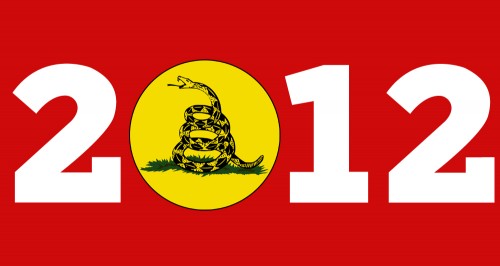
Permission is hereby granted for anyone to use this Gadsden 2012 logo for any reason whatsoever including commercial use.
(Note that Liberty Jane had a lot of stuff for sale using this image. I got a bumper sticker and a t-shirt both of which I like very much.)
Mr Obama looks like he did just about everything wrong one could think about, on the economy, in the Middle East, bringing the Olympics to Chicago, closing Gitmo, everything. There is just one tiny little thing that he got right, and that one thing is the Obama symbol with the red-white-and-blue national colors “O” symbol with the striped depiction of this great land with fertile plow furrows. Mr. Obama may go down in history as failing at everything except for the “O” symbol, which is probably the best example of graphic design evah.
The Libertarian/Conservative/Republican/Tea Party fusion movement seems to have everything going for it these days — stood down the President on tax increases, got a start on some agreement on Entitlement Reform, Health Care Reform looks to have a rough go of it in the courts, and so on. The one teeny-tiny thing the Movement has gotten wrong is that “Gadsden 2012” logo, which will go down in history as the worst, ugliest, most amateurish attempt at graphic design, evah.
Now take the colors . . . please! The original Gadsden flag is the rattlesnake graphic in dark print over a solid yellow background, and it works, especially in its original context as a battle flag. OK, OK, the Tea Party adopted this military image — isn’t there a U.S. Navy squadron with the skull and crossbones of the Jolly Roger as its tail insignia? OK, OK, the Tea Party adopted a battle flag as their emblem to denote both an “originalist” politics of returning to the time of our nation’s founding when the Gadsen Flag was current and with the rattlesnake indicating feistiness. In relation to other battle flags, say, the Jolly Roger or, heaven forbid, the Confederate Battle Flag, maybe the Gadsen Flag is a least-bad alternative.
But the colors. So, we need red white and blue in our 2012 Campaign emblem, because, every such emblem these days has to have red white and blue in it. So we do this paste job of sticking the Gadsden emblem in yellow inside white block letters and put this on a red background? Oh, and when we put it up on the blog masthead, we put this thin blue border around it?
One of the things that the Liberal-Left likes to believe about the Fusion Movement is that we are largely uneducated and stupid. The 2012 Gadsden Fusion Movement campaign emblem screams stupid, stupid, stupid — we have this stupid venomous reptile where the Obama people have and emblem of the prosperity flowing from this great land, and we have even stupider clashing colors. It screams that there is not a single person who knows the first thing about graphic design who belongs to the Fusion Movement to slow us down from committing to such an epic fail. It reinforces every Liberal-Left prejudice that we are indeed all stupid.
Paul, make a better design and circulate it.
Make something that screams smart, smart, smart.
Seriously.
No one is in charge here.
You are in charge.
Send me something good and I will put it on the blog.
Some more from me:
Criticism, however vehement, if fine and potentially helpful.
But then go the next step and do something positive if you feel that strongly.
Be constructive.
It may very well be that there is no one in the Tea Party movement who has graphic design skills.
The older I get, the clearer it is that there is often no one at all who has thought of something that seems obvious to you, among thousands of people.
You say, oh, Hell, someone must have thought of this, someone must be doing this, this must be someone else’s job.
Nope.
When you notice it, it becomes your job. No one else will do it.
Unpaid, amateur efforts are all we have.
You seem to have useful knowledge and expertise.
It is over a year until the next election. Plenty of time for something to go viral.
If I don’t get an alternative design from you soon, I will be forced to believe you are full of shit. And I’d prefer not to.
No irony: Have at it. Do better. The world is waiting. I, personally, want to see it. And if it is good, we will put it up on the blog.
Looking forward, sincerely, for the superior, Paul Malenkovic-designed logo.
Do it.
Show me.
At Lex’s suggestion on this site, I bought several of the Gadsen 2012 bumper stickers and put them on magnets. While we were on vacation near Aspen, CO, a woman with a KY license plate asked where I got it. I told her about Chicago Boyz, and Zazzle.com and then I gave her the Gadsen 2012 bumper magnet. She was psyched. Then I took the second out of my glove compartment and put it on the back of the Suburban. Got lots of rolled eyes and a few middle fingers when we were in Aspen, CO later during the trip.
Lex – I’m your buddy from Chicago, now out in Denver. Thanks for your posts.
DF, glad to hear it, and great to hear from you.
Do what you can to keep CO in the GOP column in 2012, willyaplease???
I have gotten a very good response to it, too.
I consider middle fingers a good response. That means they noticed it, understood it, and were irritated enough to respond. Good.
But, if PM has something better, or something that reaches beyond the core Tea Party, I am all for it.
Heh I get middle fingers all the time here in Madison just for my tiny NRA sticker on my car. It is just part of living in a socialist utopia. It was really amped up when I used to drive my Hummer H3.