This is a terribly boring post I am writing so I will put the rest under the fold for those of you who are interested in our job market here in Wisconsin. So, just how is Wisconsin doing under Governor Walker?
Statistics
Does this sound familiar ?
The science community is now closing in on an example of scientific fraud at Duke University. The story sounds awfully familiar.
ANIL POTTI, Joseph Nevins and their colleagues at Duke University in Durham, North Carolina, garnered widespread attention in 2006. They reported in the New England Journal of Medicine that they could predict the course of a patient’s lung cancer using devices called expression arrays, which log the activity patterns of thousands of genes in a sample of tissue as a colourful picture. A few months later, they wrote in Nature Medicine that they had developed a similar technique which used gene expression in laboratory cultures of cancer cells, known as cell lines, to predict which chemotherapy would be most effective for an individual patient suffering from lung, breast or ovarian cancer.
At the time, this work looked like a tremendous advance for personalised medicine—the idea that understanding the molecular specifics of an individual’s illness will lead to a tailored treatment.
This would be an incredible step forward in chemotherapy. Sensitivity to anti-tumor drugs is the holy grail of chemotherapy.
Unbeknown to most people in the field, however, within a few weeks of the publication of the Nature Medicine paper a group of biostatisticians at the MD Anderson Cancer Centre in Houston, led by Keith Baggerly and Kevin Coombes, had begun to find serious flaws in the work.
Dr Baggerly and Dr Coombes had been trying to reproduce Dr Potti’s results at the request of clinical researchers at the Anderson centre who wished to use the new technique. When they first encountered problems, they followed normal procedures by asking Dr Potti, who had been in charge of the day-to-day research, and Dr Nevins, who was Dr Potti’s supervisor, for the raw data on which the published analysis was based—and also for further details about the team’s methods, so that they could try to replicate the original findings.
The raw data is always the place that any analysis of another’s work must begin.
Dr Potti and Dr Nevins answered the queries and publicly corrected several errors, but Dr Baggerly and Dr Coombes still found the methods’ predictions were little better than chance. Furthermore, the list of problems they uncovered continued to grow. For example, they saw that in one of their papers Dr Potti and his colleagues had mislabelled the cell lines they used to derive their chemotherapy prediction model, describing those that were sensitive as resistant, and vice versa. This meant that even if the predictive method the team at Duke were describing did work, which Dr Baggerly and Dr Coombes now seriously doubted, patients whose doctors relied on this paper would end up being given a drug they were less likely to benefit from instead of more likely.
In other words, the raw data was a mess. The results had to be random.
I thought I recognized that name !
Obama has announced his new appointment for economic adviser. It is a Princeton economist named Alan Kreuger. I am not an economist or an expert on economists but that name rang a faint bell. Then I saw that someone else had remembered him, too.
In a 1994 paper published in the American Economic Review, economists David Card and Alan Krueger (appointed today to chair Obama’s Council of Economic Advisers) made an amazing economic discovery: Demand curves for unskilled workers actually slope upward! Here’s a summary of their findings (emphasis added):
“On April 1, 1992 New Jersey’s minimum wage increased from $4.25 to $5.05 per hour. To evaluate the impact of the law we surveyed 410 fast food restaurants in New Jersey and Pennsylvania before and after the rise in the minimum. Comparisons of the changes in wages, employment, and prices at stores in New Jersey relative to stores in Pennsylvania (where the minimum wage remained fixed at $4.25 per hour) yield simple estimates of the effect of the higher minimum wage. Our empirical findings challenge the prediction that a rise in the minimum reduces employment. Relative to stores in Pennsylvania, fast food restaurants in New Jersey increased employment by 13 percent.”
This was tremendous news, especially for Democrats. Raising the minimum wage did not increase unemployment as classical economics had said since the issue first arose.
Unfortunately, their study was soon ripped apart by other economists who used more objective methodology.
It was only a short time before the fantastic Card-Krueger findings were challenged and debunked by several subsequent studies:
1. In 1995 (and updated in 1996) The Employment Policies Institute released “The Crippling Flaws in the New Jersey Fast Food Study”and concluded that “The database used in the New Jersey fast food study is so bad that no credible conclusions can be drawn from the report.”
2. Also in 1995, economists David Neumark and David Wascher used actual payroll records (instead of survey data used by Card and Krueger) and published their results in an NBER paper with an amazing finding: Demand curves for unskilled labor really do slope downward, confirming 200 years of economic theory and mountains of empirical evidence (emphasis below added):
I would suggest reading the entire post which demolishes the study by Kreuger and Card. This is the new Chairman of the Council of Economic Advisers. More academics with no real world experience and this one is incompetent even as an academic. Spengler has a few words on the matter, as well.
Poverty and Statistics
I am repairing a gap in my education by reading Thomas Sowell’s classic, Vision of the Anointed, which was written in 1992 but is still, unfortunately, as valid a critique of leftist thought as it was then. As an example of his methods, he constructs an experiment in statistics. This concerns poverty and inequality and, in particular, the poverty of leftist thinking.
He imagines an artificial population that has absolute equality in income. Each individual begins his (or her) working career at age 20 with an income of $10,000 per year. For simplicity’s sake, we must imagine that each of these workers remains equal in income and at age 30, receives a $10,000 raise. They remain exactly equal through the subsequent decades until age 70 with each receiving a $10,000 raise each decade. He (or she) then retires at age 70 with income returning to zero.
All these individuals have identical savings patterns. They each spend $5,000 per year on subsistence needs and save 10% of earnings above subsistence. The rest they use to improve their current standard of living. What statistical measures of income and wealth would emerge from such a perfectly equal pattern of income, savings and wealth?
| Age | Annual Income | Subsistence | Annual Savings | Lifetime Savings |
| 20 | $10,000 | $5,000 | $500 | $0 |
| 30 | $20,000 | $5,000 | $1,500 | $5,000 |
| 40 | $30,000 | $5,000 | $2,500 | $20,000 |
| 50 | $40,000 | $5,000 | $3,500 | $45,000 |
| 60 | $50,000 | $5,000 | $4,500 | $80,000 |
| 70 | $0 | $5,000 | $0 | $125,000 |
Unfortunately, even with an Excel spreadsheet, I cannot get these numbers to line up properly.
[Jonathan adds: Many thanks to Andrew Garland for providing html code to display these numbers clearly.]
Now, let us look at the inequities created by this perfectly equal income distribution. The top 17% of income earners has five times the income of the bottom 17% and the top 17% of savers has 25 times the savings of the bottom 17%. That is ignoring those with zero in each category. If the data were aggregated and considered in “class” terms, we find that 17% of the people have 45% of the all the accumulated savings for the whole society. Taxes are, of course, ignored.
What about a real world example ? Stanford California, in the 1990 census, had one of the highest poverty rates in the Bay Area, the largely wealthy region surrounding San Francisco Bay. Stanford, as a community, has a higher poverty rate than East Palo Alto, a low income minority community nearby. Why ? While undergraduate students living in dormitories are not counted as residents in census data, graduate students living in campus housing are counted. During the time I was a medical student, and even during part of my internship and residency training, my family was eligible for food stamps. The census data describing the Stanford area does not include all the amenities provided for students and their families, making the comparison even less accurate. This quintile of low income students will move to a high quintile, if not the highest within a few years of completion of graduate school, A few, like the Google founders, will acquire great wealth rather quickly. None of this is evident in the statistics.
Statistics on poverty and income equality are fraught with anomalies like those described by Professor Sowell. That does not prevent their use in furthering the ambitions of the “anointed.”
Happy Birthday, Emlyn, and Applause, xkcd
[ by Charles Cameron — cross-posted from Zenpundit ]
*
My son, Emlyn, turns sixteen today.
He’s not terribly fond of computers to be honest — but he does follow xkcd with appreciation, as do I from time to time: indeed, I am led to believe I receive some credit for that fact.
So… this is a birthday greeting to Emlyn, among other things. And a round of applause for Randall Munroe, creator of xkcd. And a post comparing more reliable and less reliable statistics, because that’s a singularly important issue — the more reliable ones in this/ case coming from a single individual with an expert friend, the less reliable ones coming from a huge corporation celebrated for its intelligence and creativity… and with a hat-tip to Cheryl Rofer of the Phronesisaical blog.
The DoubleQuote:
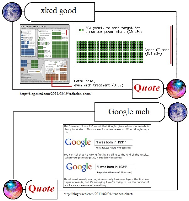
Radiation exposure:
Today, xkcd surpassed itself / his Randallself / ourselves, with a graphic showing different levels of radiation exposure from sleeping next to someone (0.05 muSv, represented by one tiny blue square top left) or eating a banana (twice as dangerous, but only a tenth as nice) up through the levels (all the blue squares combined equal three of the tiny green ones, all the green squares combined equal 7.5 of the little brown ones, and the largest patch of brown (8Sv) is the level where immediate treatment doesn’t stand a chance of saving your life)…
The unit is Sieverts, Sv: 1000 muSv = 1 mSv, 1000 mSv= 1 Sv, sleeping next to someone is an acceptable risk at 0.05 muSv, a mammogram (3 mSv) delivers a little over 50,000 times that level of risk and saves countless lives, 250 mSv is the dose limit for emergency workers in life-saving ops — oh, and cell phone use is risk-free, zero muSv, radiation-wise, although dangerous when driving. [I apologize for needing to write “mu” when I intend the Greek letter by that name, btw — software glitch with the ZP version of WordPress.]
The xkcd diagram comes with this disclaimer:
There’s a lot of discussion of radiation from the Fukushima plants, along with comparisons to Three Mile Island and Chernobyl. Radiation levels are often described as “ times the normal level” or “% over the legal limit,” which can be pretty confusing.
Ellen, a friend of mine who’s a student at Reed and Senior Reactor Operator at the Reed Research Reactor, has been spending the last few days answering questions about radiation dosage virtually nonstop (I’ve actually seen her interrupt them with “brb, reactor”). She suggested a chart might help put different amounts of radiation into perspective, and so with her help, I put one together. She also made one of her own; it has fewer colors, but contains more information about what radiation exposure consists of and how it affects the body.
I’m not an expert in radiation and I’m sure I’ve got a lot of mistakes in here, but there’s so much wild misinformation out there that I figured a broad comparison of different types of dosages might be good anyway. I don’t include too much about the Fukushima reactor because the situation seems to be changing by the hour, but I hope the chart provides some helpful context.
Blog-friend Cheryl Rofer, whose work has included remediation of uranium tailings at the Sillamäe site in Estonia (she co-edited the book on it, Turning a Problem Into a Resource: Remediation and Waste Management at the Sillamäe Site, Estonia) links to xkcd’s effort at the top of her post The Latest on Fukushima and Some Great Web Resources and tells us it “seems both accurate and capable of giving some sense of the relative exposures that are relevant to understanding the issues at Fukushima” — contrast her comments on a recent New York Times graphic:
In other radiation news, the New York Times may have maxed out on the potential for causing radiation hysteria. They’ve got a graphic that shows everybody dead within a mile from the Fukushima plant. As I noted yesterday, you need dose rate and time to calculate an exposure. The Times didn’t bother with that second little detail.
In any case, many thanks, Cheryl — WTF, NYT? — and WTG, xkcd!
Google:
Once again, xkcd nails it.
I’ve run into this problem myself, trying to use Google to gauge the relative frequencies of words or phrases that interest me — things like moshiach + soon vs “second coming” + soon vs mahdi + soon, you know the kinds of things that I’m curious about, I forget the specific examples where it finally dawned on me how utterly useless Google’s “About XYZ,000 results (0.21 seconds)” rankings really are — but the word needs to get out.
Feh!
Paging Edward Tufte.
Sixteen today:
Happy Birthday, Emlyn!