Wise words from two old masters…
Japan
Of the tsunami and Mt. Fuji
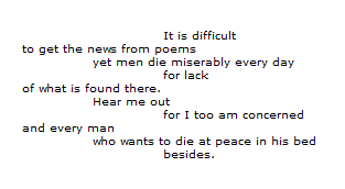
I’ve been thinking quite a bit about William Carlos Williams and his observation in Asphodel, That Greeny Flower:
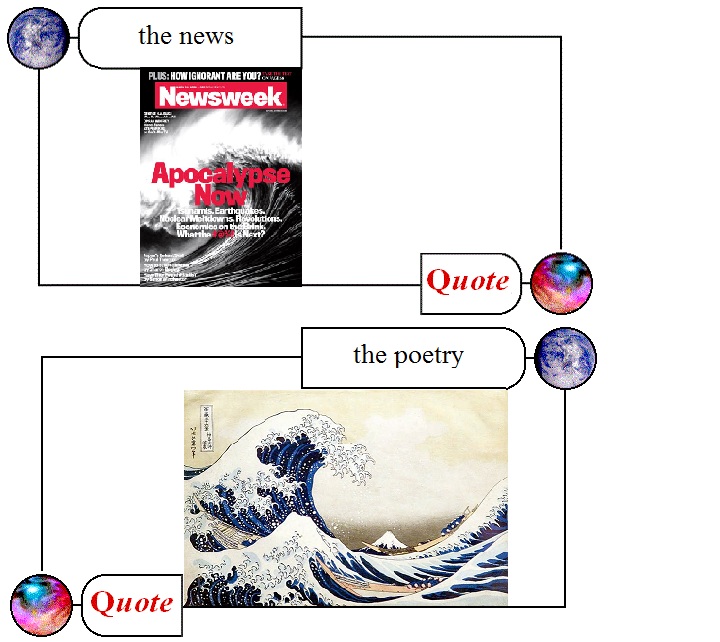
Our news media blare with (apocalyptic but not revelatory) trumpets…
while Hokusai, painting circa 1831, conveys the vulnerability of the (Japanese and human) situation with his image of boats in a storm.
*
Here’s Dr. Barnett, in my own transcript of his video this week:
The surprise factor here really shouldn’t exist in our minds. I mean the mega-disaster of a tsunami plus and earthquake plus a nuclear meltdown in Japan well, those three are already highly linked. Japan highly depends on nuclear power, it’s one of the most seismically active island chains in the world, and tsunami is a Japanese word. So if you are going to put a forty year old very aging early technology nuclear power plant right on the coast in Japan, the only mega-disaster you’re going to get there is an earthquake-triggered, tsunami-delivered nuclear meltdown. So these are not surprising connections, we’re just bumping into the connectivity that’s natural and only becoming more expansive as globalization advances.
That’s exactly right and Hokusai should have been an early warning.
The only thing missing from Barnett’s analysis, and present in Hokusai, is Mt. Fuji or what TS Eliot (to circle back again to “verbal” poetry) would call “the still point of the turning world”.
Happy Birthday, Emlyn, and Applause, xkcd
[ by Charles Cameron — cross-posted from Zenpundit ]
*
My son, Emlyn, turns sixteen today.
He’s not terribly fond of computers to be honest — but he does follow xkcd with appreciation, as do I from time to time: indeed, I am led to believe I receive some credit for that fact.
So… this is a birthday greeting to Emlyn, among other things. And a round of applause for Randall Munroe, creator of xkcd. And a post comparing more reliable and less reliable statistics, because that’s a singularly important issue — the more reliable ones in this/ case coming from a single individual with an expert friend, the less reliable ones coming from a huge corporation celebrated for its intelligence and creativity… and with a hat-tip to Cheryl Rofer of the Phronesisaical blog.
The DoubleQuote:
Radiation exposure:
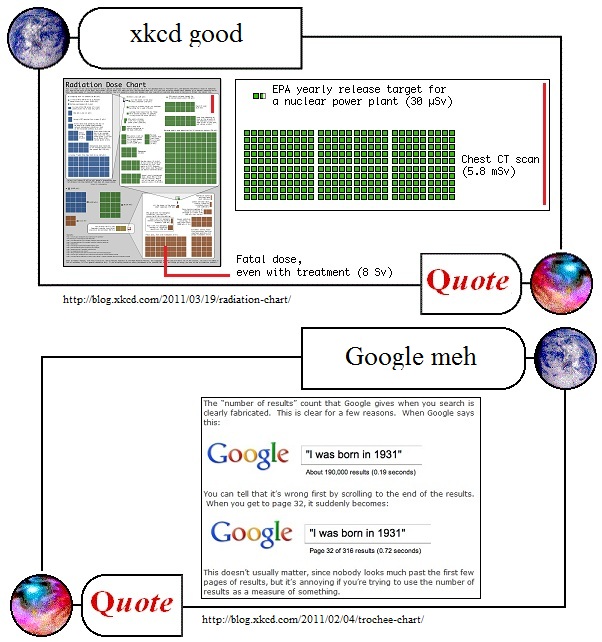
Today, xkcd surpassed itself / his Randallself / ourselves, with a graphic showing different levels of radiation exposure from sleeping next to someone (0.05 muSv, represented by one tiny blue square top left) or eating a banana (twice as dangerous, but only a tenth as nice) up through the levels (all the blue squares combined equal three of the tiny green ones, all the green squares combined equal 7.5 of the little brown ones, and the largest patch of brown (8Sv) is the level where immediate treatment doesn’t stand a chance of saving your life)…
The unit is Sieverts, Sv: 1000 muSv = 1 mSv, 1000 mSv= 1 Sv, sleeping next to someone is an acceptable risk at 0.05 muSv, a mammogram (3 mSv) delivers a little over 50,000 times that level of risk and saves countless lives, 250 mSv is the dose limit for emergency workers in life-saving ops — oh, and cell phone use is risk-free, zero muSv, radiation-wise, although dangerous when driving. [I apologize for needing to write “mu” when I intend the Greek letter by that name, btw — software glitch with the ZP version of WordPress.]
The xkcd diagram comes with this disclaimer:
There’s a lot of discussion of radiation from the Fukushima plants, along with comparisons to Three Mile Island and Chernobyl. Radiation levels are often described as “ times the normal level” or “% over the legal limit,” which can be pretty confusing.
Ellen, a friend of mine who’s a student at Reed and Senior Reactor Operator at the Reed Research Reactor, has been spending the last few days answering questions about radiation dosage virtually nonstop (I’ve actually seen her interrupt them with “brb, reactor”). She suggested a chart might help put different amounts of radiation into perspective, and so with her help, I put one together. She also made one of her own; it has fewer colors, but contains more information about what radiation exposure consists of and how it affects the body.
I’m not an expert in radiation and I’m sure I’ve got a lot of mistakes in here, but there’s so much wild misinformation out there that I figured a broad comparison of different types of dosages might be good anyway. I don’t include too much about the Fukushima reactor because the situation seems to be changing by the hour, but I hope the chart provides some helpful context.
Blog-friend Cheryl Rofer, whose work has included remediation of uranium tailings at the Sillamäe site in Estonia (she co-edited the book on it, Turning a Problem Into a Resource: Remediation and Waste Management at the Sillamäe Site, Estonia) links to xkcd’s effort at the top of her post The Latest on Fukushima and Some Great Web Resources and tells us it “seems both accurate and capable of giving some sense of the relative exposures that are relevant to understanding the issues at Fukushima” — contrast her comments on a recent New York Times graphic:
In other radiation news, the New York Times may have maxed out on the potential for causing radiation hysteria. They’ve got a graphic that shows everybody dead within a mile from the Fukushima plant. As I noted yesterday, you need dose rate and time to calculate an exposure. The Times didn’t bother with that second little detail.
In any case, many thanks, Cheryl — WTF, NYT? — and WTG, xkcd!
Google:
Once again, xkcd nails it.
I’ve run into this problem myself, trying to use Google to gauge the relative frequencies of words or phrases that interest me — things like moshiach + soon vs “second coming” + soon vs mahdi + soon, you know the kinds of things that I’m curious about, I forget the specific examples where it finally dawned on me how utterly useless Google’s “About XYZ,000 results (0.21 seconds)” rankings really are — but the word needs to get out.
Feh!
Paging Edward Tufte.
Sixteen today:
Happy Birthday, Emlyn!
Good-Bye, Tokyo
Minutes ago I received an Email. It seems that the US military has ordered a “voluntary evacuation of military dependents from the Tokyo/Yokosuka region.”
As my source has a very young child, her husband and daughter will be leaving the country very soon. Details are sketchy at this time, but it appears that they will be flown to Korea before repatriation to the States.
An Update and Other Links
This past Wednesday, I heard Bing West give a talk about Afghanistan and his new book The Wrong War: Grit, Strategy, and the Way Out of Afghanistan, at the Chicago Council on Global Affairs. When I get a chance, I will write up a post. He is a very good public speaker: energetic, lively, clear.
Boston.com’s The Big Picture has some truly horrifying photos of the Japanese tsunami and earthquake. Here is the American Red Cross link. If our readers and commenters have additional links or sites they think important, please leave them in the comments section.
I think the following two articles might be of interest for our readers:
Bryson has pulled off a marvelous feat. He devotes almost every chapter to a room in his Victorian house in England. He then considers why the room is the way it is and what preceded it. In doing so he produces an important economic history, only some of which will be familiar to economic historians and almost all of which will be unfamiliar to pretty much everyone else. A large percentage of it is important, for two reasons: One, you get to pinch yourself, realizing just how wealthy you are; and two, you get a better understanding than you’ll get from almost any high school or college history textbook of the economic progress that made you wealthy. Not surprisingly, given that I’m an economist and Bryson isn’t, I have a few criticisms of places where he misleads by commission or omission. But At Home’s net effect on readers is likely to be a huge increase in understanding and appreciation of how we got to where we are.
– David R. Henderson, Hoover Institution, Stanford University.
The disturbing truth that modern Western COIN theory is built on a handful of books based upon practitioner experiences in a handful of 20th-century conflicts is not mitigated by the less famous but broader COIN works. Country studies by lesser known writers are similarly restricted. The core texts cover Vietnam (French Indochina), Algeria, Northern Ireland, the Philippines, and Malaya. The less-well-known writers will go on to discuss Mozambique, Angola, El Salvador, or Afghanistan under the Soviets. Only the most adventurous writers and theorists braved traveling as far as Kashmir or India to look at what could be learned there. Subsequently, the modern study of counterinsurgency and the doctrine it gave birth to are limited to less than two dozen conflicts in a century that witnessed more than 150 wars and lesser conflicts, domestic and interstate (see table 1).
– Sebastian L.v. Gorka and David Kilcullen, Joint Force Quarterly (JFQ)


